Chapter 1: The Olympic Symbol
|
* After learning about the Elements and Principles of Design, we were to put that knowledge to the test; By using geometric shapes, we recreated a scene from a picture of ONE Olympic sport. I chose fencing, because sword fights have kind of became a huge part of my hobby-life. (Star Wars, sword-dueling in movies and in general)
* What I like about this project was showing my appreciation to fencing and to the world of sword fighting with this project. * What I didn't like was how different mine was compared to others. I didn't really follow out the "stand-out" or "pop-out" element (not Of Design) to the project. Also when I spray-glued the final project onto the construction paper, I put a little too much on it that there is some moisture at the center of it that is kind of see-through to the construction paper. (For The Technical Project) 
|

|
Chapter 2: The Monogram
|
* The Monogram was one of, if not my favorite project in this class so far. I love to make movies home-made with my electronic devices (iphone, ipad) and I have been doing so since 2015. So the movie camera was the perfect image for the monogram project, where we hide our initials in places of the image. My initials are GML. Look closely, can you see them?
* What I liked was being able to express a huge aspect of my personality that I hope one day will be my career in the future. * There is nothing to not like when it comes to making this project. It was fun creating something that someone has to really look at. Because the more you look, the more you know. 
|

|
Chapter 3: The Icon Set
|
* This is exactly why I love this class: we get to express our personalities into art! I had to choose six pieces of my personality or hobbies and put them all together in a set showing you how I like to make videos on YouTube, that I like to make movies, to make music, to write, to draw and to watch movies.
* Making art with my personality as the ingredients is the real treat for an artist. And I get to do that everyday. * I made this project in the best way that I could. There is nothing to dislike. |
|
Chapter 4: The Maze
* This time I had to be careful, because the project was being designed for a child at 4 - 7 years old. I like a lot of intense things that may be inappropriate for kids or things they will never understand nor will really like at that age. So I had to choose something that I really like, and something that a lot of kids know and really like today. Match Found! Star Wars.
* I get to use the love and appreciation for Star Wars so that a young child can become a rebel by destroying the Death Star (in the maze). And that is the other thing I like about this, is that I am thinking about kids as I made this because I am good with kids and I understand them a lot.
* What I didn't like was that there are some lines in the maze that are closed off for the child but are too small. I didn't fix that, because I kept thinking that if I did, then it would mess up the entire maze and I would have to start over.

|

|
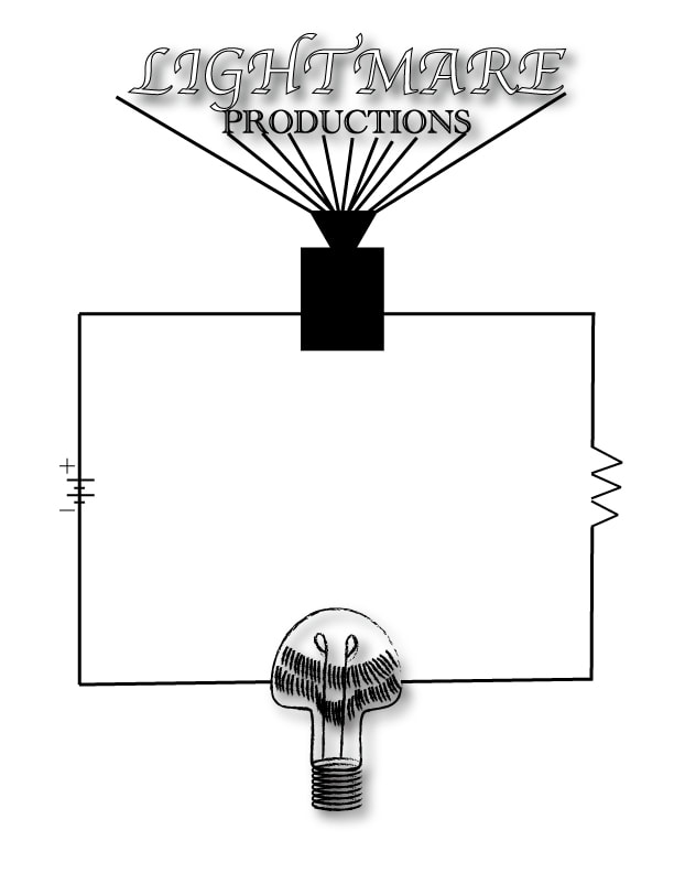
Chapter 5: The Logo
* This project was coincidentally fun. I got to create a logo for a fictitious company. And how it was a coincidence was that for weeks before this project I would draw a lightbulb with a scary face on it and I would call it "Lightmare Productions". So I kept the idea and used it for this project, but with a more different design and a simpler title. I was also able to go above and beyond making three other logo designs along with the color and the grayscale version of the logo.
* I got to be creative making a logo for my own imaginative filming company, "Lightmare Filming". Where intense action, fantasy and horror movies are filmed and produced.
* There was nothing to dislike in making this logo.
* I got to be creative making a logo for my own imaginative filming company, "Lightmare Filming". Where intense action, fantasy and horror movies are filmed and produced.
* There was nothing to dislike in making this logo.
|
|
|

|

|
Chapter 6: The Low Poly Portrait
|
* The Low Poly project was an interesting project to go through, and I am glad that I did what I could in the best of my ability. It was off to a good start, until I was gratefully reminded by my peers that I was supposed to be using the Pen tool and not the Line Segment tool the entire time. I worked way too hard and way too long on this project, I am already stressed out enough on getting ready for the next project, but I am happy with the final piece(s).
* I liked using lines to connect each other into making triangles. The outlook of it was nice, but it was definitely shocking knowing that I was doing it wrong. * I hated having to work for so long, that it seemed impossible to finish. * Here is the end result on the right. And the outlook of it all without the portrait photo on the bottom. * I did my best. And that is all I am happy for. 
|

|
Chapter 7: Hand-Cut Screen Print
* This project was the definition of time and practice. And I am proud to have completed it. We were to choose a photo that we would image trace and put film on top of it so that we could cut all of the BLACK PARTS of the photo. We would then grab colored paper and ink and a whole lot of other tools to top it off with a finished print of the same photo you chose.
* What I liked about this project was that I got to choose I photo from anything that I liked. My first thought was Moon Knight because of the new Disney+ series that was an absolute hit, but the picture had too much white or would be too difficult for me to attempt. Next was a Nazgul or a Ringwraith from Lord Of The Rings because I was reading the books. But that had too much black and was hard to tell what it was. I still wanted to do something from Lord Of The Rings, and it was just then as I was incredibly excited to read the book that is a prequel to Lord Of The Rings, The Silmarillion, I wanted my photo to be of the main antagonist of The Silmarillion, Morgoth. The photo was agreed upon including the official title of the Lord Of The Rings font, since that Morgoth is from the same fictional universe, and with the right materials including an X-acto knife, and after a good amount of practice, I was ready to cut some film.
* What I didn't like about the project was how difficult it kind of was, but again, after a little time and practice I was able to get help, and I got through it, and now it has ben completed.
* It took about 7 attempts to get the printing of the photo just right.
* Below: Original photo (Top Left), successful hand cut film of photo (Top Right), hand cut film taped to screen ready to print (Bottom Right), Final successful print (Bottom Left).
* Color of choice for the ink for printing was Royal Blue!


|


|
Chapter 8: Tutorials
* Shortly after the completion of the first screen printing project, I was successfully able to start working on tutorials that at least two are required to be made and completed by the end semester. The first one I was able to complete in a matter of a couple of days was the Stained Glass Effect in Illustrator.

* Completed on May 12th, 2022
* Tutorial link: https://design.tutsplus.com/tutorials/how-to-create-a-stained-glass-effect-in-illustrator--vector-3235 |
* The Stained Glass Effect was the tutorial that first caught my eye, because it looked difficult. It's when you make a frame as seen in the tutorial image with basic vector shapes, and with using a bunch of colors and effects, you will learn how to create the fun glass effect in Illustrator that will make your frame look like it belongs in a church as a window.
* What I liked about this tutorial was how fun it was to follow along and learn how the project transitions from nothing to what you see as the end result on the left. * What I did not like was the actual following along part. I watched the tutorial video that was provided with it. And the guy did a great job with the tutorial, however, because it was a video, he goes pretty fast and it was hard to keep up. So what I did to make it somewhat easier was to slow down the video at 0.25x speed. But, all it took was patience, time, and relaxation while paying attention to complete your tutorial with an outstanding result. |
|
* My second tutorial was the Holographic Effect. This tutorial was pretty simple as long as you pay full attention to the video or to the instructions. I chose this one, because the colors looked fun to make and edit, and it looked like that it was worth the try. Good thing that it was, because I liked it.
* What I did like about this tutorial was that it was a pretty simple tutorial when you look at the outlook of it, and I always like to enjoy the transition to the end result just like with the Stained Glass Effect. * Like with the Glass Stain, I had to slow down the video to the slowest it can get just to follow along. And it is not fun when it is at regular speed. He goes too fast! |

* Completed on May 25th, 2022
*Tutorial link: https://design.tutsplus.com/tutorials/how-to-create-a-holographic-effect-in-illustrator--cms-39755 |
Chapter 9: The Screen-Print Shirt Project
* This project will bring you into the world of being in a business: what you need to do is have a partner, agree with your partner and with your teacher on an image (make sure that it is school appropriate) and you have this paper that explains what would be the marketability of this shirt that your making. For me, that was confusing and troubling. But me and my partner got through with it. The rest of it was fun, because I knew that eventually we will get to keep some of the shirts and that we can wear them whenever we'd like.
* I liked this project, because we got to print a cool image of once again Morgoth, but without the Lord Of The Rings title on the upper left corner on a couple of shirts. And I am proud of the two most successful of the four shirts that were done. These two stood out to me the most, but I am proud of all of them.
* I did not like this project, because it dealt with a lot of things that I was not familiar with, and with things that would have been way too hard to accomplish if I did this by myself.

|

|

|

Chapter 10: The Event Poster
|
* Let me tell you about this project: It was a breeze. With it being the last full week of school (Week Of May 22nd) I had to get everything done: My shirt, my tutorials and my event poster. I started this project on Thursday, the 26th and finished it on the next day. It was quite simple but I enjoyed my time once again watching the transition from start to finish.
* I loved this project, because I got to choose my favorite music artist, RIOT. Actually RIOT is an electronic dance music (EDM) producing duo. They are known for the amazing songs in their album, Dogma Resistance. I got to trace the outline of the graphic that is on the cover of the album as well as the RIOT logo font, placing lines over the graphic, and with a little bit of research and picking where the concert should take place, I put them all together to create this event poster of RIOT: Dogma Resistance LIVE. * There was nothing that I disliked about this project. It was a fun, quick project to work on and I am proud of the result. |

|
